How I built our design system with the dev team to keep 20+ pages consistent
DataFlow — the design system underneath a low-code platform banks use to automate their operations

DataFlow is an anonymized name for the platform and the company that built it. Any interface text shown here is translated to English; employer and client names are anonymized.
DataFlow is a low-code automation platform for banks. Instead of waiting on engineering for every new process, a bank's own analysts build the automations themselves — assembling flows on a canvas out of blocks, where each block is a small, configurable operation. By the time I joined, the product had already grown to 20+ pages and 50+ block types, built fast by a small team.
The users are analysts on bank operations teams — power users who live in the product all day, building and running flows that touch real money and real customer data. That raises the stakes on consistency: a control that behaves one way on one screen and differently on the next isn't just untidy. It makes analysts second-guess a tool that touches real money.
- Keeping 20+ pages consistent while the product kept growing. The pages had been built fast, each making its own small decisions. Spacing, controls, and patterns had started to drift — and every new page added to the divergence.
- A system that holds up across 50+ block types. A low-code product is combinatorial: the same handful of patterns repeat across dozens of block types, and will repeat across dozens more. The system had to make the next block consistent by default, not a fresh design each time.
- Building it with the dev team, so it actually got used. A design system nobody implements is just a Figma library. The harder part was a shared vocabulary and documented component behavior the developers would build against.
This was foundation work, and I framed it that way from the start. Before I could design the workflow canvas or the per-block settings well, the product needed a system underneath them — otherwise I'd be designing on sand, reopening settled questions on every screen.
So I designed the system from scratch — every component drawn, specced, and documented for this product. One pragmatic constraint shaped it: the dev team built on Ant Design's React library, so I kept Ant's interaction conventions as the base where they cost nothing, and spent the design effort where the platform is genuinely unlike anything off the shelf — workflow nodes, block-settings patterns, and the customized controls Ant doesn't have. Consistency became the default, and the team stopped re-deciding margins and button states page by page.
The first job was an honest audit. I went through the existing pages and inventoried what was actually in use: how many spacing values, how many button variants, how many near-identical greys had crept in. Most of it could collapse to a much smaller, intentional set.
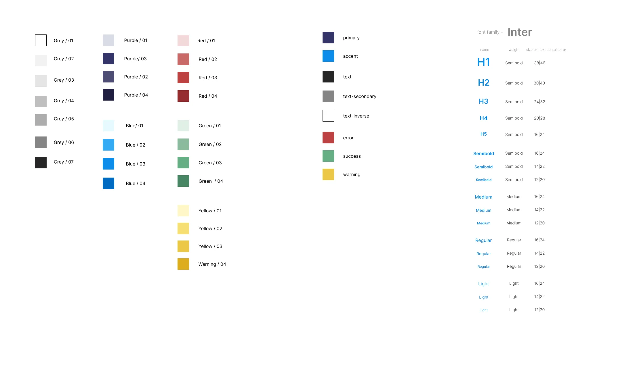
From that audit I defined the foundations — a seven-step grey ramp, five color ramps with semantic roles on top, one type family (Inter) with a fixed scale, and the core controls. Not as an academic exercise: every value was chosen against the real pages that needed it, so the system fit the product instead of fighting it. After that, a new page came out consistent on its own, because the pieces only existed in the agreed sizes.
What makes a low-code platform different is that the interface is combinatorial. Fifty-plus block types, each with its own settings, and more landing over time. If every block were drawn by hand, consistency would be a losing battle from the first month.
So I built the system around the repeating unit, not the individual page. The patterns a block needs to configure itself — inputs, toggles, validation, the anatomy of a settings panel — became shared, documented components. Adding a new block type meant assembling agreed pieces, not inventing a new layout. The system carried the consistency, so the team didn't have to police it by hand.
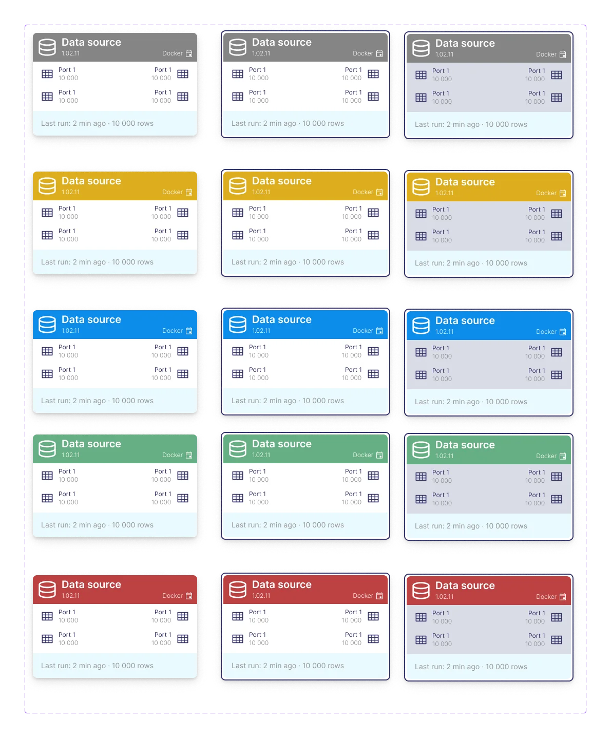
The workflow node is the clearest example: one component, five statuses, three interaction states — every combination assembled from the same tokens rather than drawn by hand.
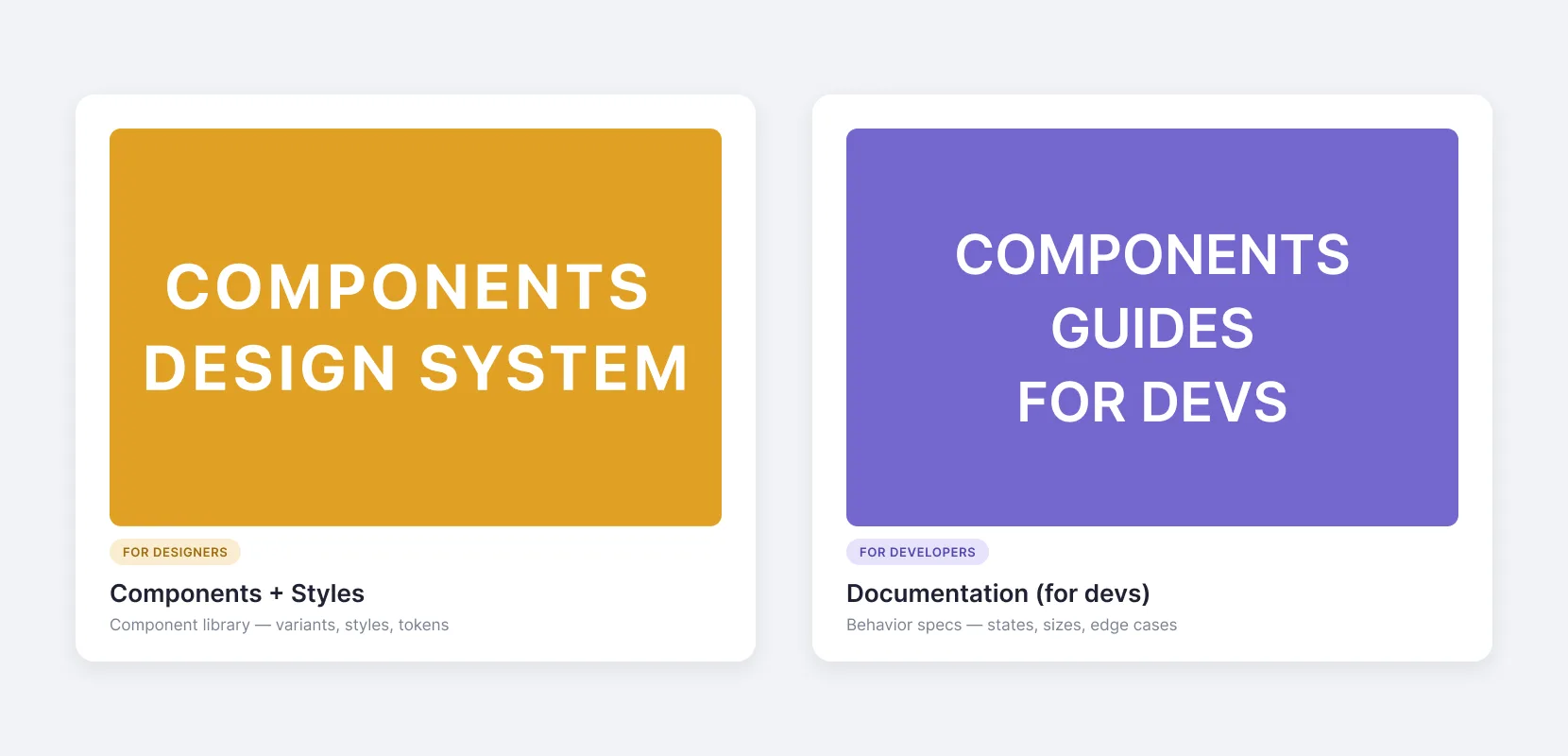
A design system only really exists once it's in the code, so I worked with the developers from the start rather than tossing a library over the wall. The structure of the workspace says it best: I ran the system as two separate Figma files for two audiences. Designers get the component library — variants, styles, tokens. Developers get their own documentation file — how each component should behave: its states, its edge cases, what's allowed where — not just how it should look.
Each page in the dev file documents one component's behavior — states, sizes, feedback, and where we customized beyond the Ant conventions. That shared vocabulary changed the everyday work: when a designer and a developer both say the standard settings panel and mean exactly the same thing, a whole category of back-and-forth disappears.
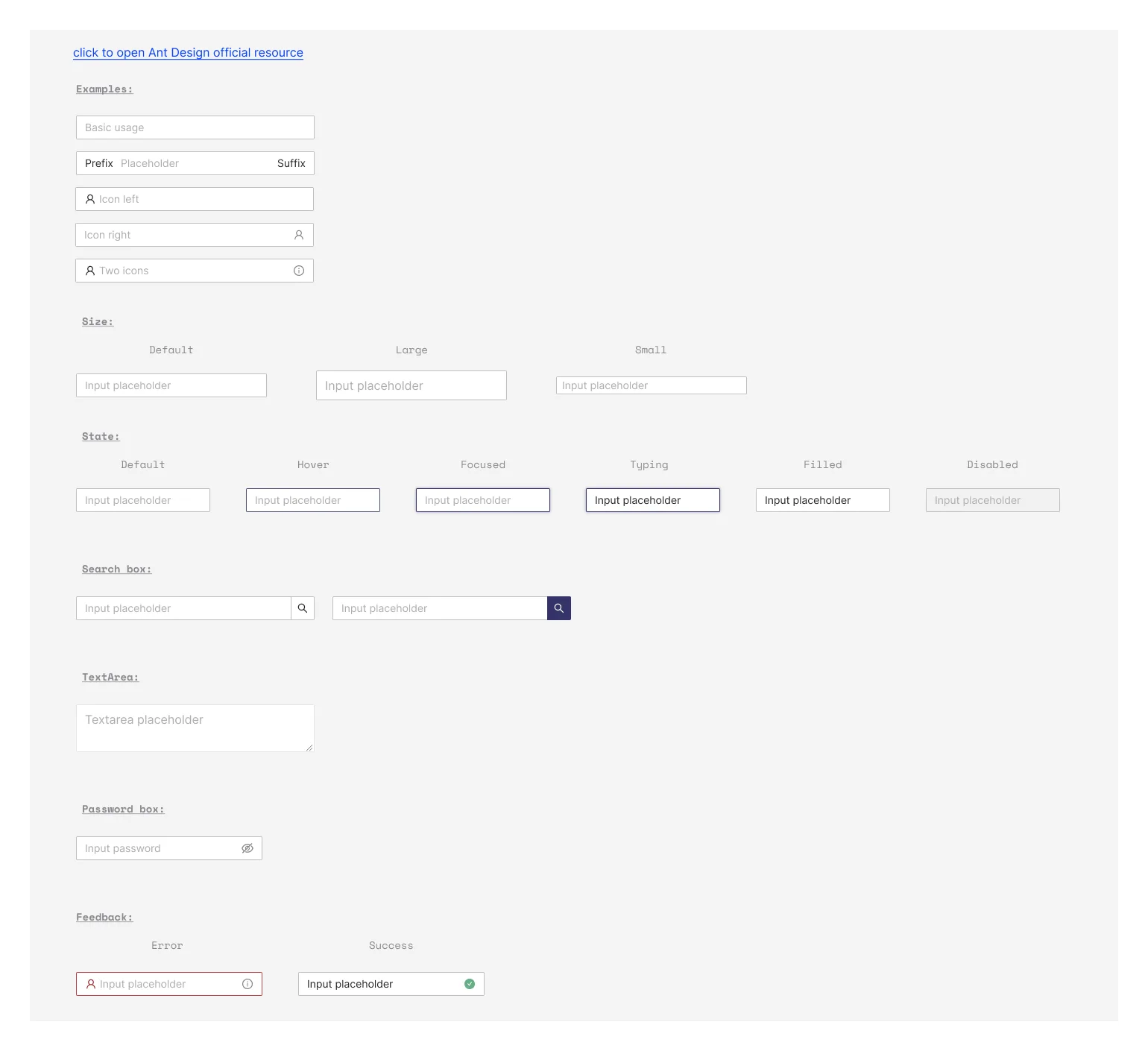
The system was never finished the way a deliverable is finished — it kept growing with the product. It grew out of the real product — that first audit — rather than a blank-canvas ideal, so adopting it didn't mean rebuilding everything at once; new pages and block types extended it instead of working around it.
I also didn't try to systematize everything on day one. The foundations and the high-frequency components came first, because they bought the most consistency for the least effort. The long tail followed as the product actually needed it.
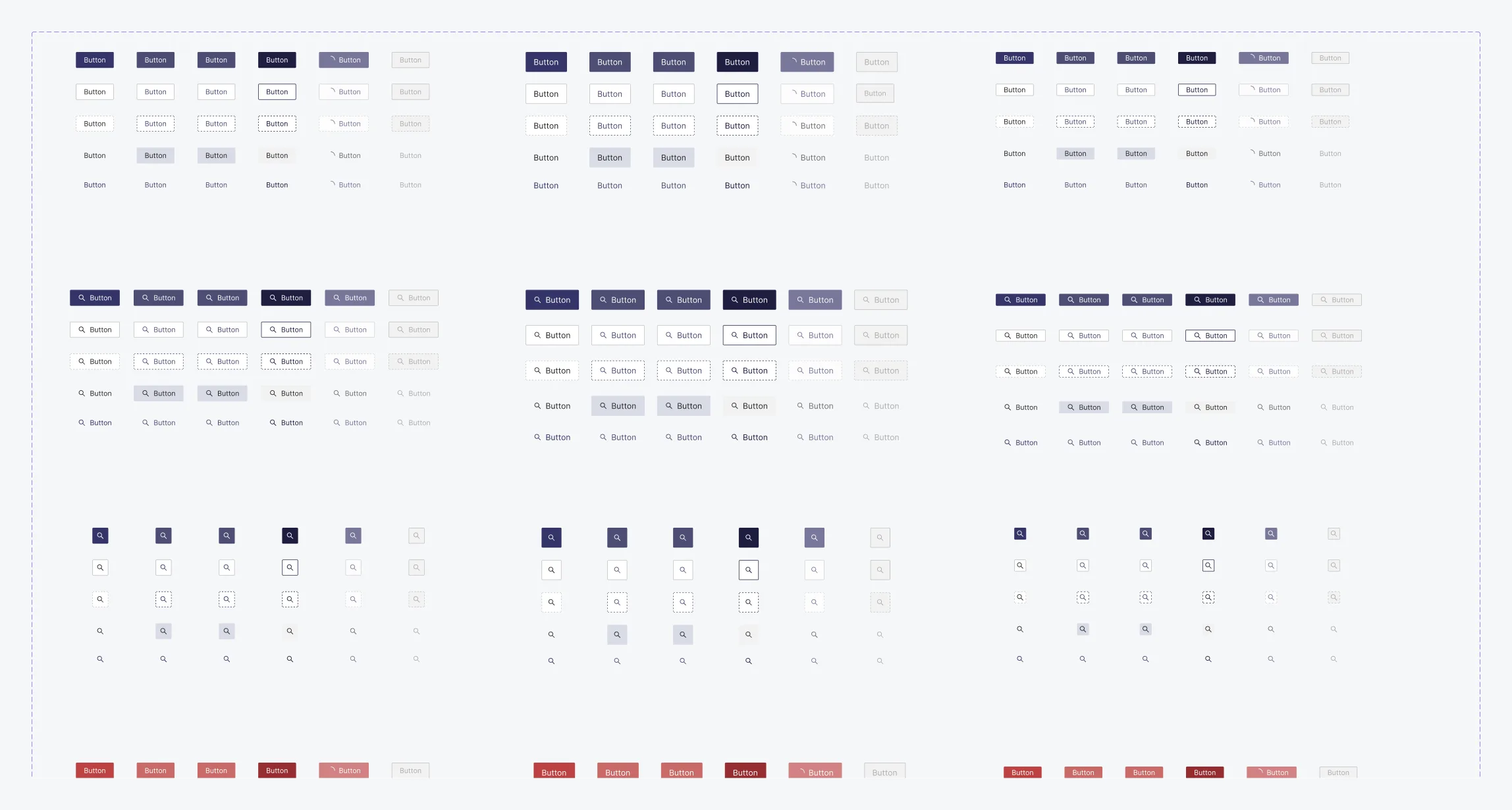
- 20+ pages brought under one consistent system.
- 50+ block types the component patterns had to cover.
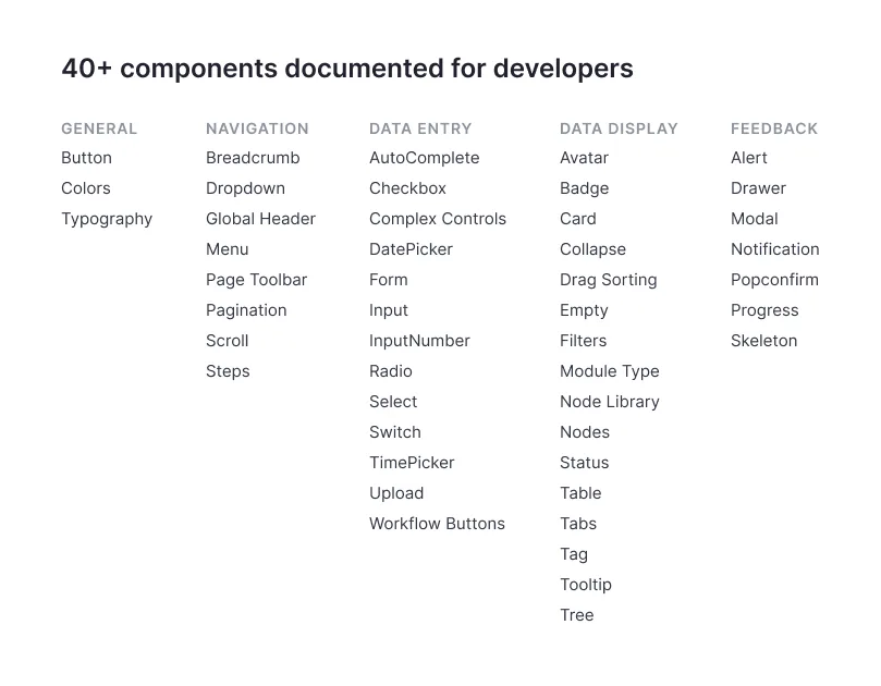
- 40+ components documented for developers, across five categories — from buttons to workflow nodes.
- 1 design system, designed from scratch — the platform's first.