

Settings UX for 50+ block types — without making users hate us
DataFlow — redesigning block settings as a template system, not fifty separate pages
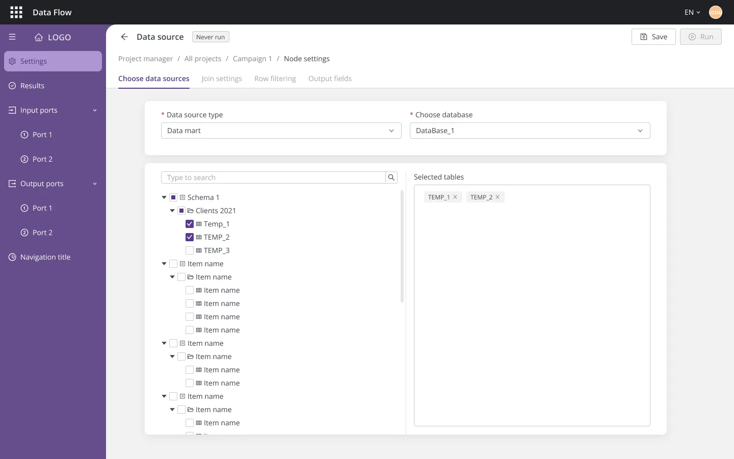
DataFlow is an anonymized name for the platform and the company that built it. Interface text is translated to English; employer and client names are anonymized.
Every block on the DataFlow canvas has a settings page — and with 50+ block types, those pages had become the platform's biggest accumulation of UX debt. Each had been designed one at a time as the product grew: same job, slightly different layout, slightly different behavior. Analysts felt it as friction; the team felt it as cost, because every new block type meant designing and building yet another settings page from scratch.
Two years in, I got the chance to attack the problem properly: a redesign of the settings experience, from visual language down to page structure.
- Fifty pages can't be fifty designs. Hand-designing settings per block type doesn't scale — the redesign had to produce a system that generates consistent pages, not a stack of mockups.
- Modernize without discarding what worked. The v1 design system had earned real muscle memory. The new visual language had to feel like an evolution analysts could walk into, not a different product.
- The hardest block had to prove it. A template system that only handles the easy cases proves nothing. It had to carry the most complex configuration in the product — the data source node.
The business case wasn't aesthetics. A template system changes the economics of the product: a new block type stops being a design-and-build project and becomes an instantiation — pick the template, fill in the block-specific card. Consistency comes from the system itself instead of from design review. And a maturing platform selling to banks simply needed to look the part.
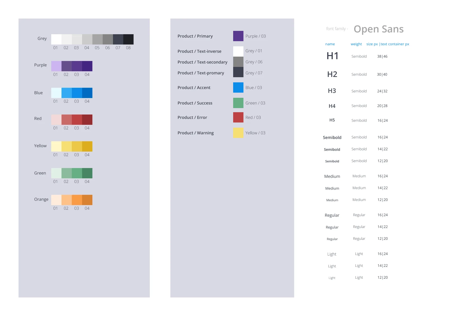
This was my second design system for the same product, and everything v1 taught went into it: fewer, harder tokens; components specced with their setting-card patterns from day one; and a visual language — purple accent, calmer greys, roomier type — chosen to make the product feel mature instead of fashionable.
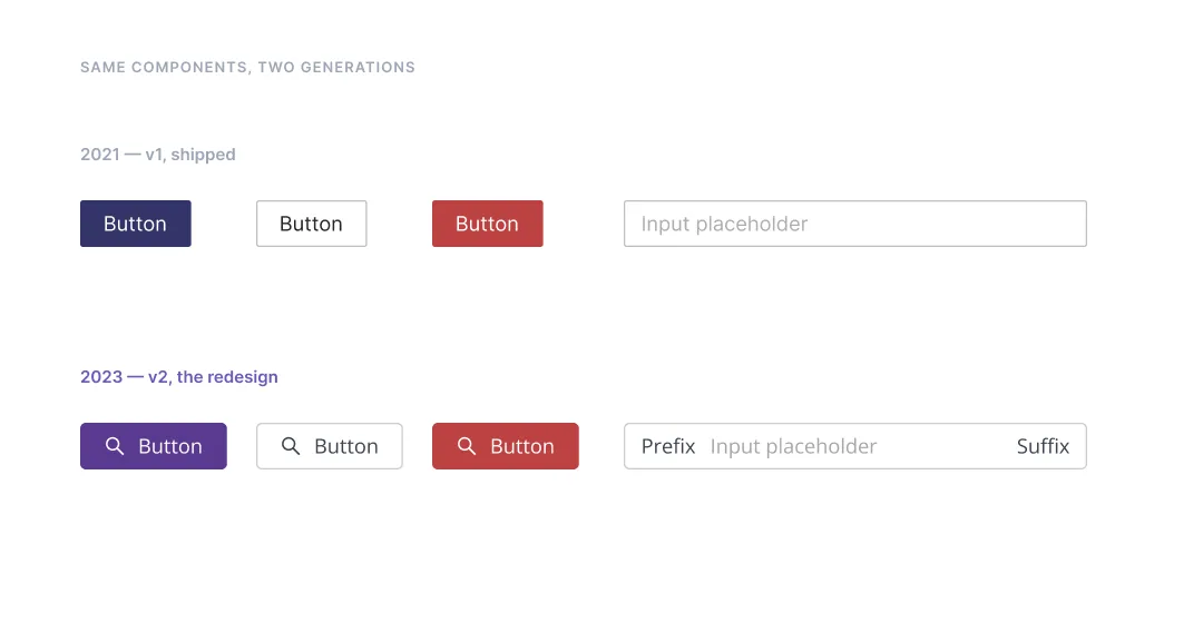
The controls kept their names and their jobs — a Primary button is still a Primary button — so the redesign asked nothing of the analyst's muscle memory. It just looks like the product grew up.
The core move: design the settings page once. One skeleton — sidebar with ports, tabs, breadcrumb, run header — specced responsively for 1440 and 1920 with open and collapsed menu states. Every block type starts from that skeleton and adds only what makes it unique: its setting cards.
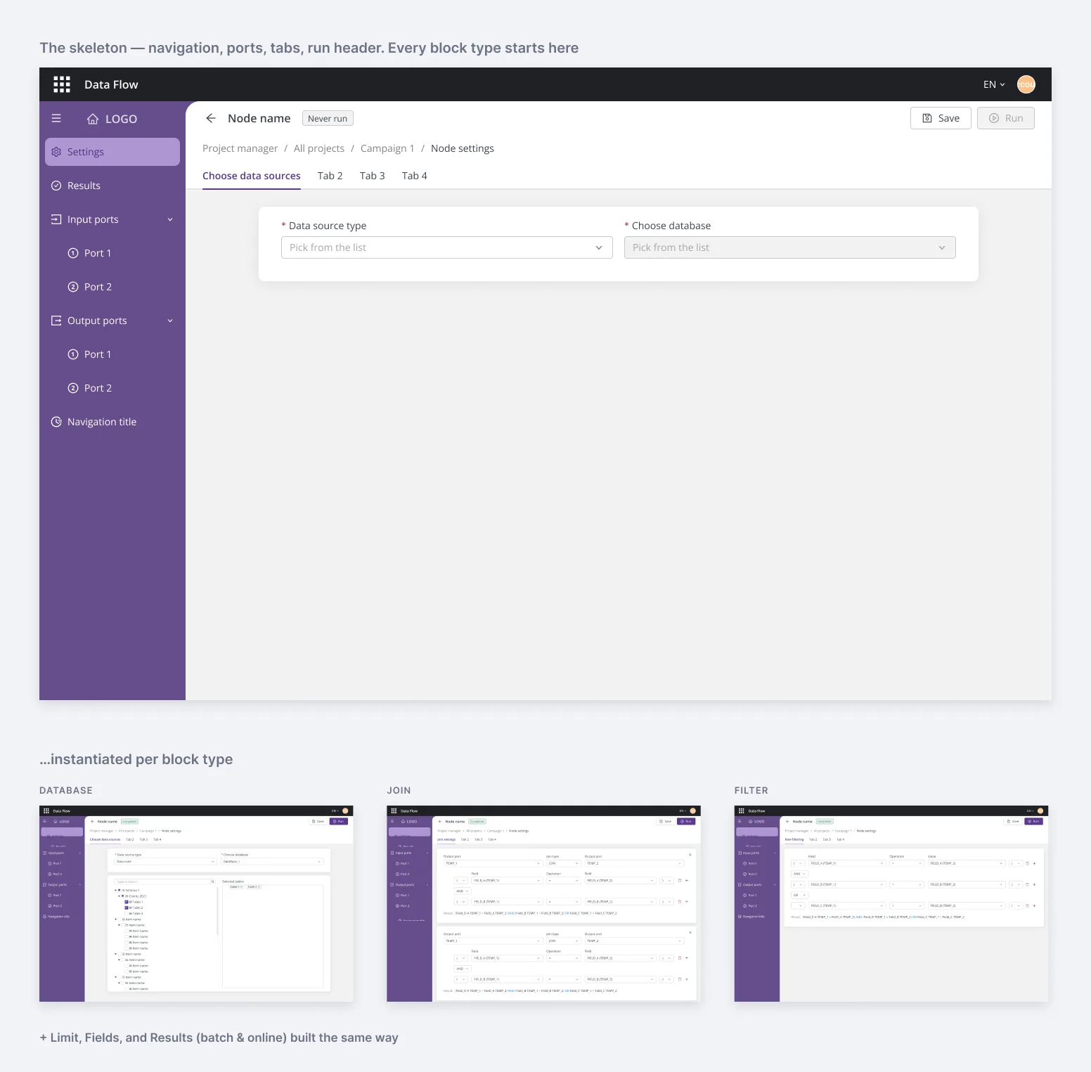
Each template shipped as a dev-ready spec — sizes and spacing redlined, fixed and fluid zones marked — so implementing a new block's settings page became assembly work rather than interpretation.
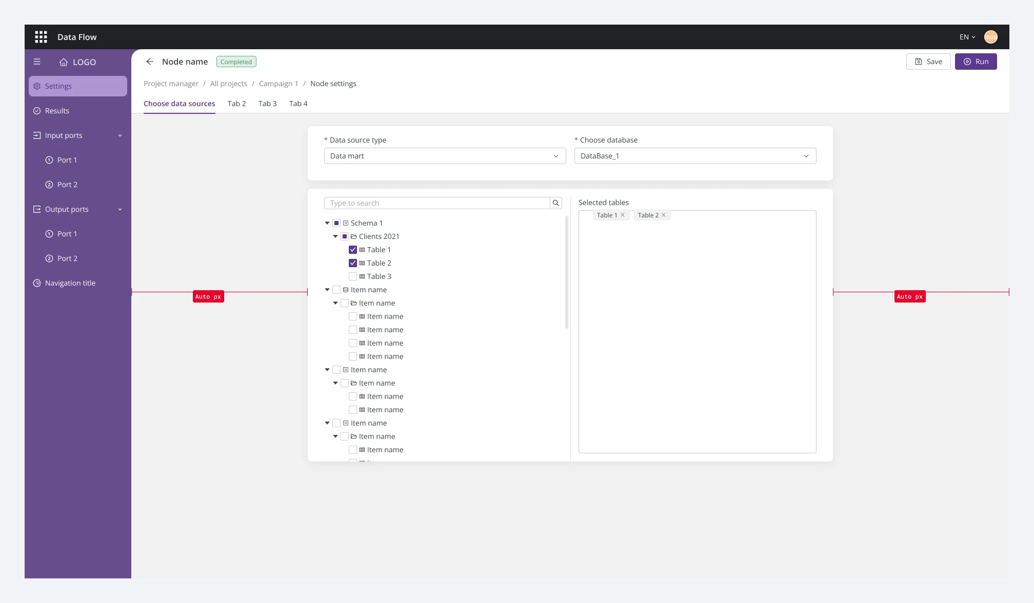
The data source node is the platform's heaviest configuration: choose a source, join tables, filter rows, pick a subsegment, shape output fields. The redesign turned it into a five-step walk along the tabs of the same skeleton — each step one card, each card one decision. Three of the five steps:
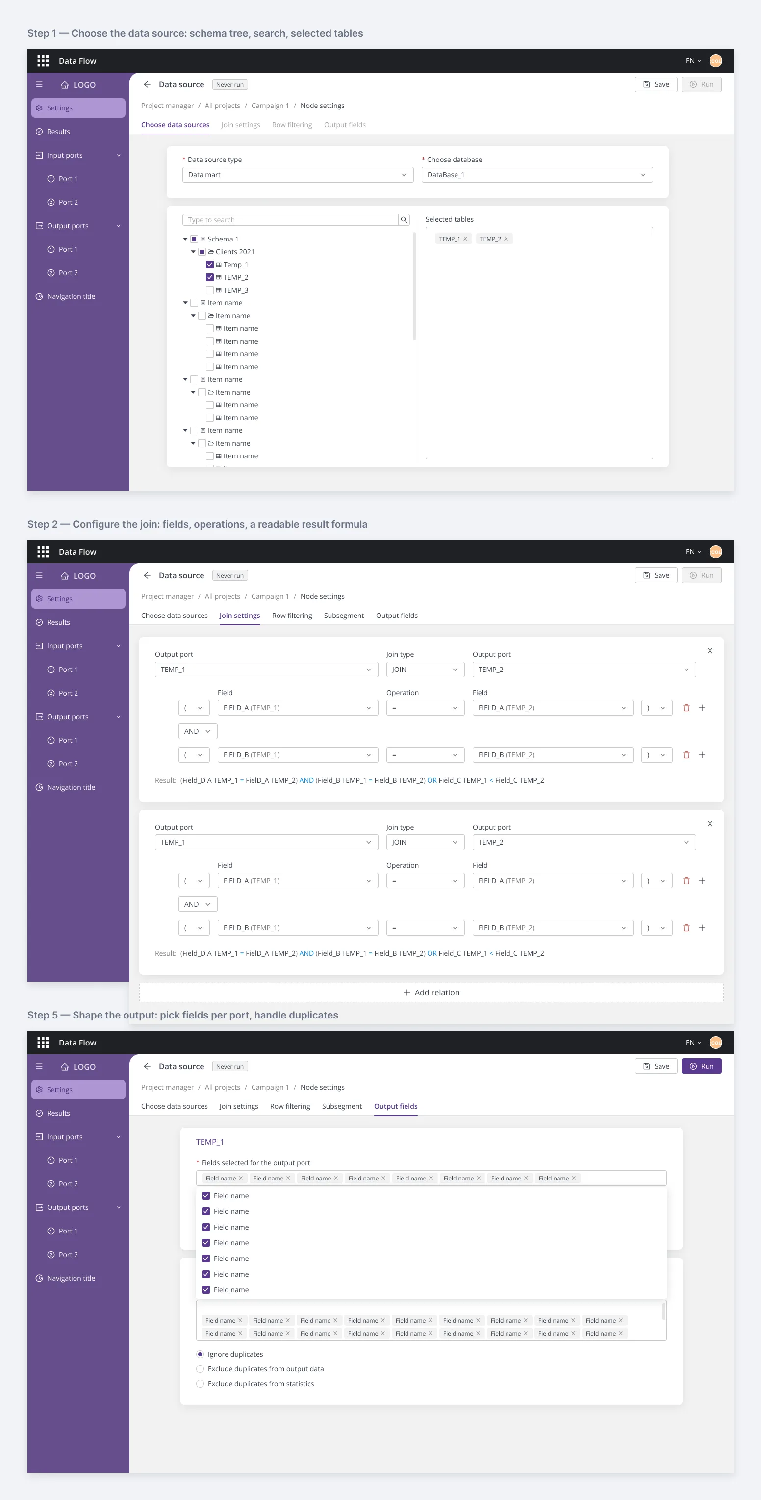
The redesign was ready — kit, templates, and the flagship node specced for development — when the startup was acquired by a larger company, and the release never shipped. I've made my peace with it. The template system was validated against the product's hardest block, the specs were complete enough to build from, and the approach — design the system, not fifty screens — is one I'd take again on any product where the UI multiplies.
- 7 page templates — Database, Join, Filter, Limit, Fields, and Results in batch and online variants — from one skeleton.
- 5 steps to configure the platform's most complex block.
- 2 breakpoints (1440 / 1920), each with open and collapsed menu states, redlined for devs.
- 50+ block types the system was built to serve.
- 2nd design system I built for the same product — this time knowing everything the first one taught.