

Designing a loan origination system for two people sharing one screen
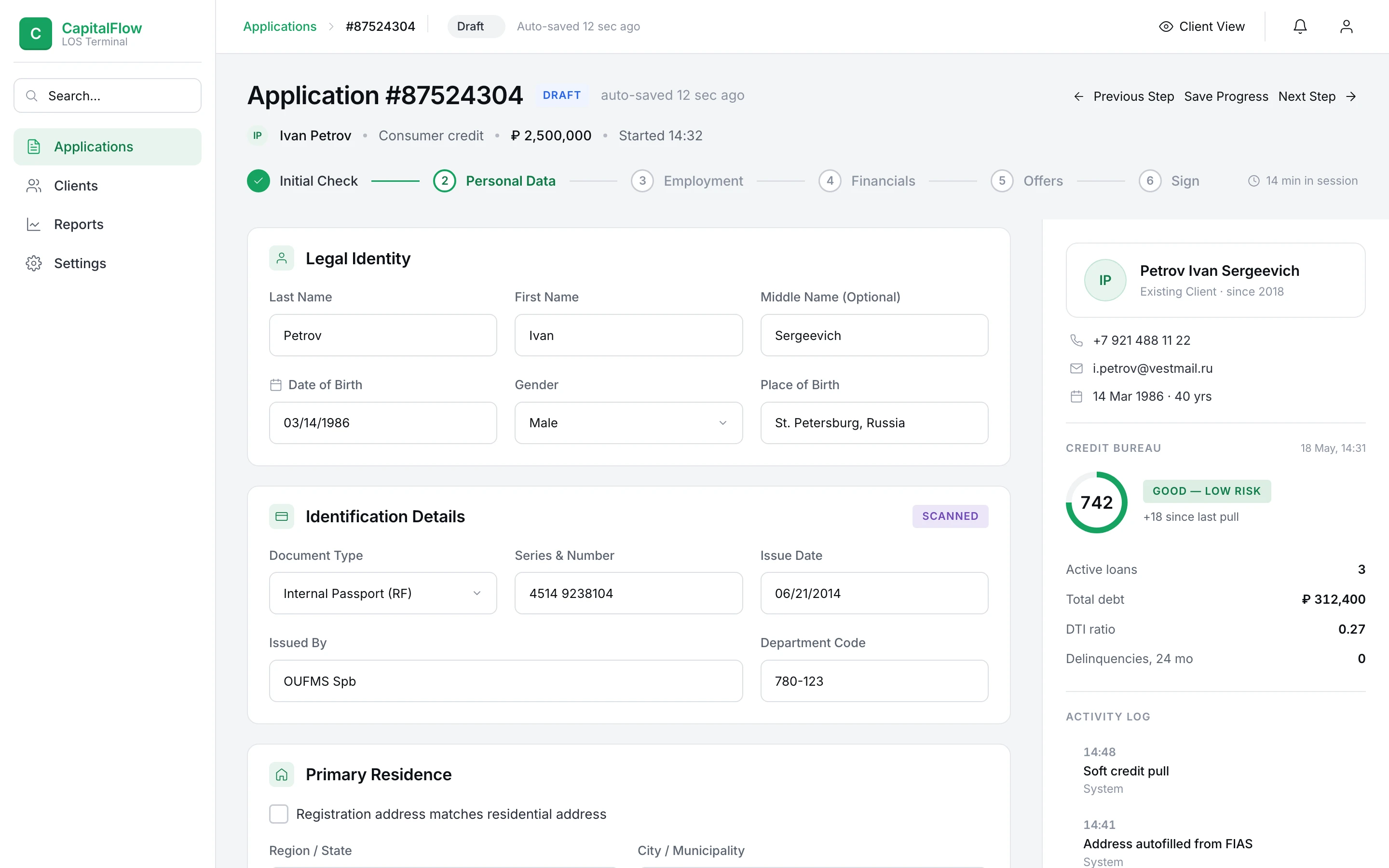
CapitalFlow Bank — the in-branch workstation bankers use to take a loan application from intake to signature
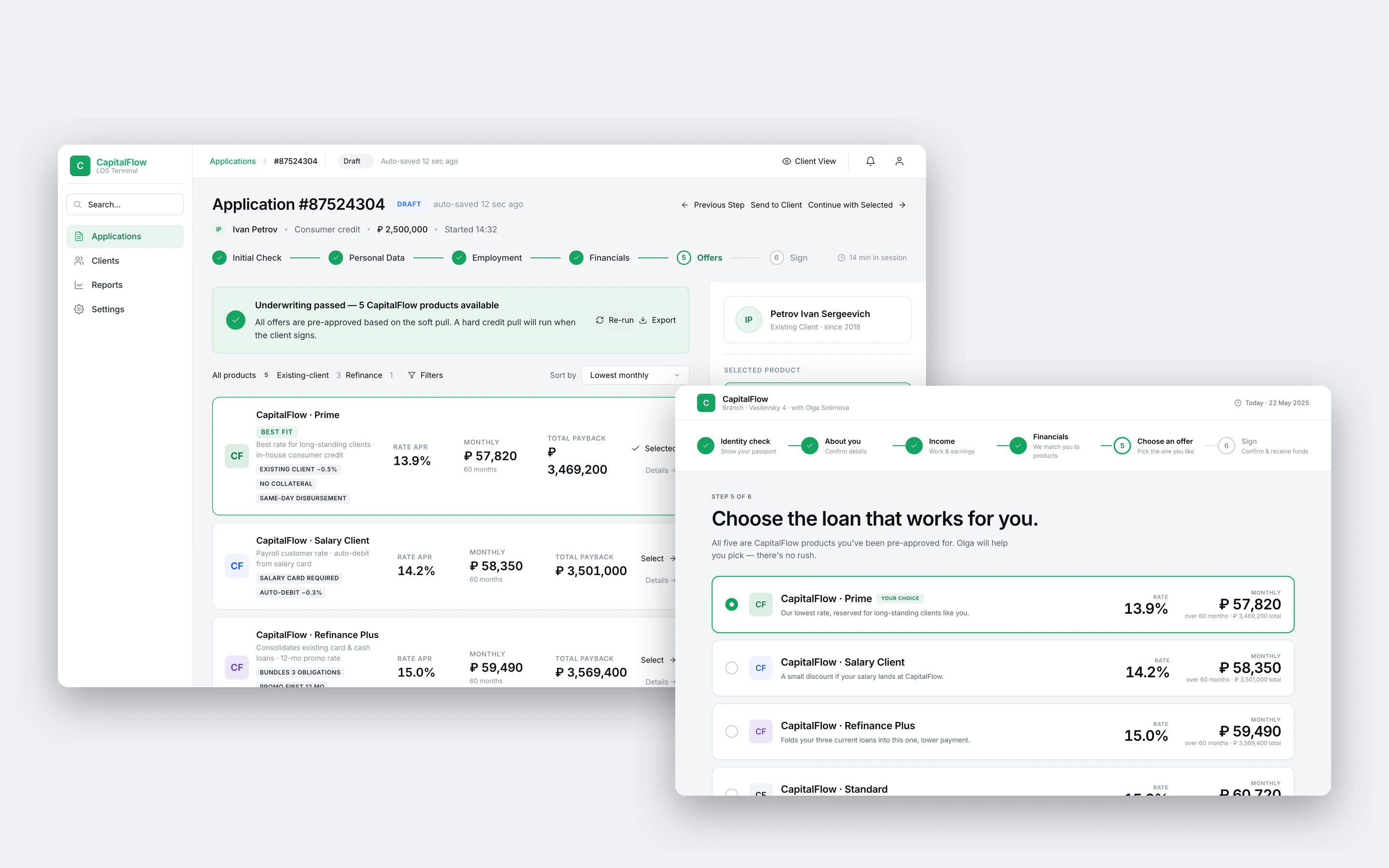
CapitalFlow is a stand-in name; client and employer names are anonymized and every value on the screens is fictional.
CapitalFlow Bank's branch employees use this system every time a client walks in to apply for a loan. The banker captures the client's data — personal details, income, assets, the loan they want, supporting documents — and the system generates a set of personalized credit offers from it. The banker then walks the client through those offers, tunes the terms, compares options, and signs.
It was built as a tool for one person: the banker, a power user who lives in the product all day. That assumption turned out to be wrong, and catching it reshaped the whole project.
Before touching a single layout, I ran sessions with the bankers who use the product every day. I expected to be validating field order and flow. Instead I caught something nobody had designed for: the moment the offers appear, bankers routinely turn the monitor around and show them to the client directly.
That one habit reframed the whole product. The system had been built for a single user — but there was a second one sitting across the desk the entire time, and that second user is nothing like the first. Any age, any comfort level with technology, seeing the screen for the first and only time. A layout tuned for a banker's speed is exactly the wrong layout for a 68-year-old reading an offer through their glasses.
Without those sessions we would have shipped one dense interface, tuned for the banker, and the client would have kept squinting at a screen that was never meant for them.
Before any screens, the research had to become a shape. One in-branch session, two audiences: six steps the banker drives, a single decision point where the screen changes hands, three steps the client takes alone behind a PIN lock, and a locked path back to signing.
The rest of the case is about making each box on that map work.

- One interface for two people at the same desk. The banker needs density, speed, every field within reach. The client needs the opposite — large type, one thing at a time, no jargon. Serving both without building and maintaining two separate apps.
- Designing the hand-off moment. Turning the monitor is the pivot the whole flow exists to reach. What the client sees there can't just be the banker's screen at a bigger size — it has to be built for them.
- Looking like a bank, not a fintech demo. Modernizing without sliding into the gradient-blobs-and-glassmorphism look B2B fintech has worn for years. Banks are conservative for a reason, and the interface has to respect that.
The first design question wasn't visual. It was: do you build two products, or one product that knows where it is?
I considered three approaches.
Two apps — banker and client talking over a shared session. Cleanest on paper. The engineering team would have hated me by week two, and no bank deploys two apps to every branch terminal.
A client mode the banker activates manually. Better — but it puts a decision on the banker every time they want to involve the client. They'd skip it.
What I landed on: a Client View toggle that lives on every screen, in the same position, with the same shortcut. The banker hits it without thinking. The screen reformats — type goes up to an 18–20px minimum, banker-side controls hide, density collapses into one clear focus.
The toggle moves the same product through three roles inside one appointment:
- Companion mode during intake — banker reads the form aloud, client confirms over their shoulder.
- Presentation mode at offers — monitor turned 180°.
- Companion mode again at customization — banker steers, client follows along.
The toggle is the simple part. The decision behind it is what mattered: one product that adapts to where the screen physically sits in the room.
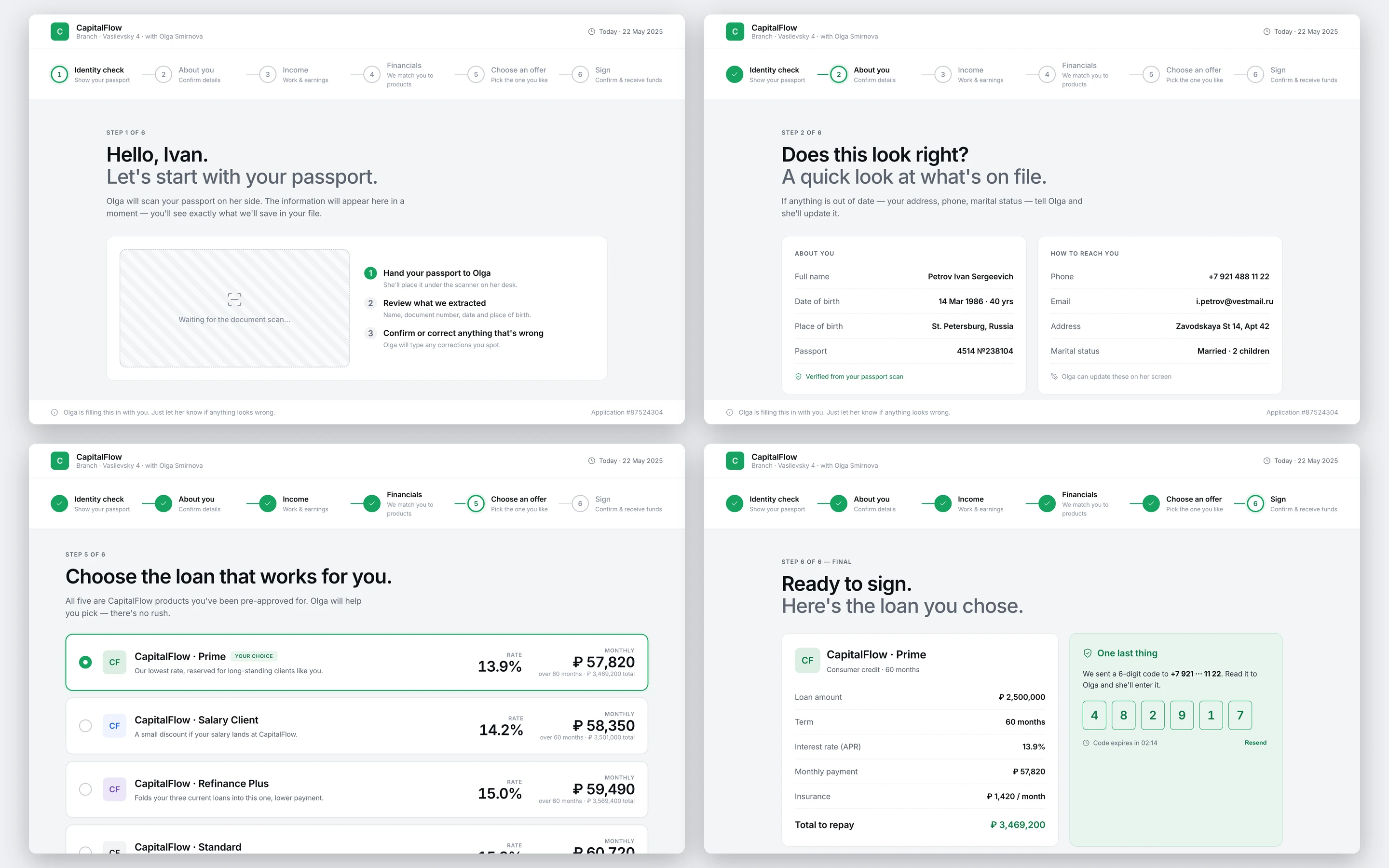
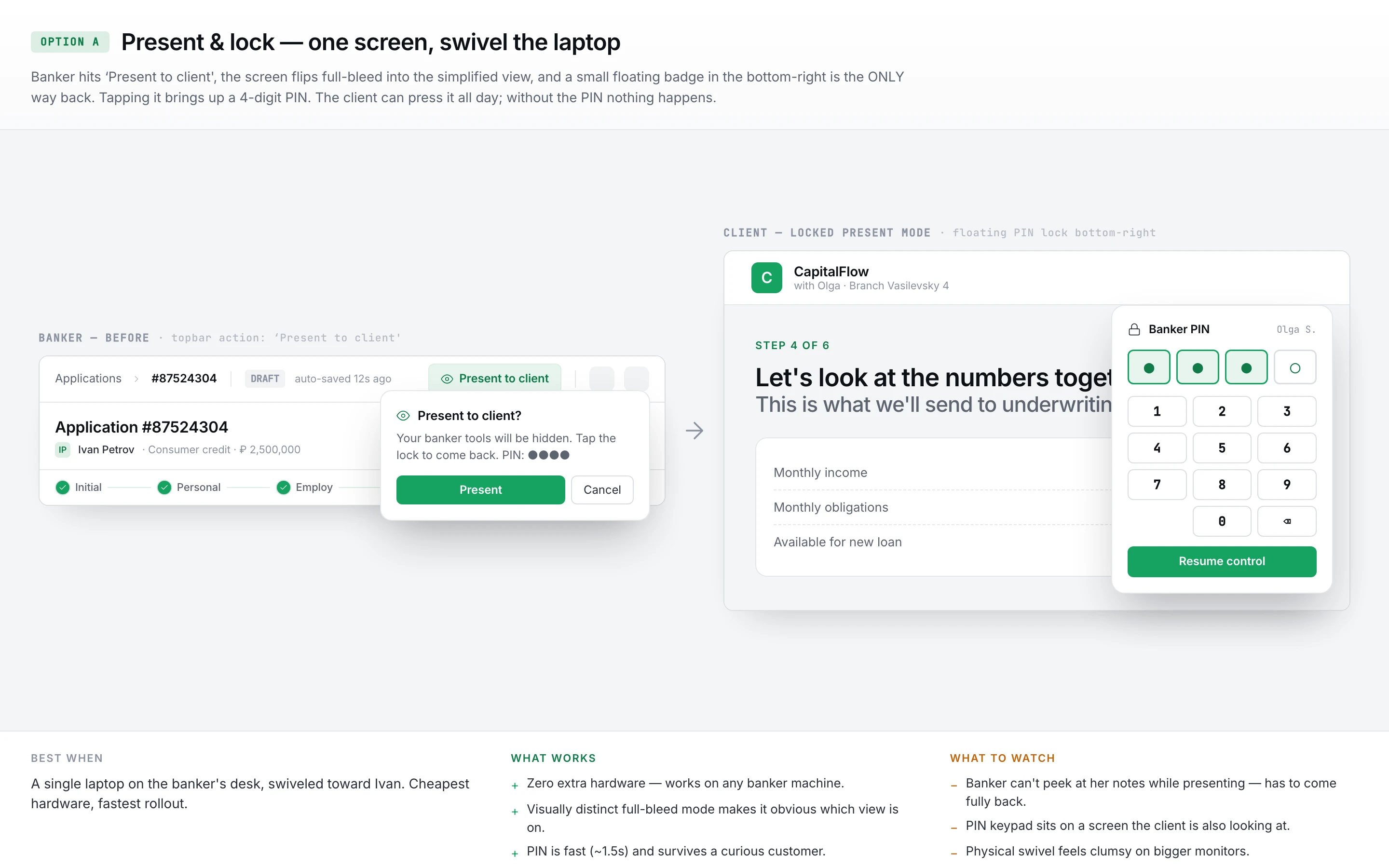
The Client View toggle solved what the client sees. It didn't solve the physical moment — how the screen actually changes hands. Watching real appointments, that hand-off was clumsy: bankers swiveling monitors, sliding keyboards aside, hovering a hand over the mouse while the client leaned in. No layout fixes that, so I designed three ways to make the hand-off itself feel deliberate:
- Present & lock. One screen. The banker hits “Present to client”, the interface flips to Client View full-bleed, and a four-digit PIN keeps the way back on the banker's side.
- Dual display. A second, customer-facing monitor mirrors the client-relevant step live. No swivel at all, and the banker never loses their working screen.
- Phone as remote. The same swivel, but the banker's controls move to their phone — advance a step, blank the screen, jump back — without reaching across the desk.
I'd lead with Present & lock: no new hardware, works on the desks branches already have. Dual display is there for branches that want the client to never see a swivel; phone-as-remote for bankers who'd rather keep the screen private until the reveal. One insight, three ways to make the hand-off feel intentional instead of awkward.
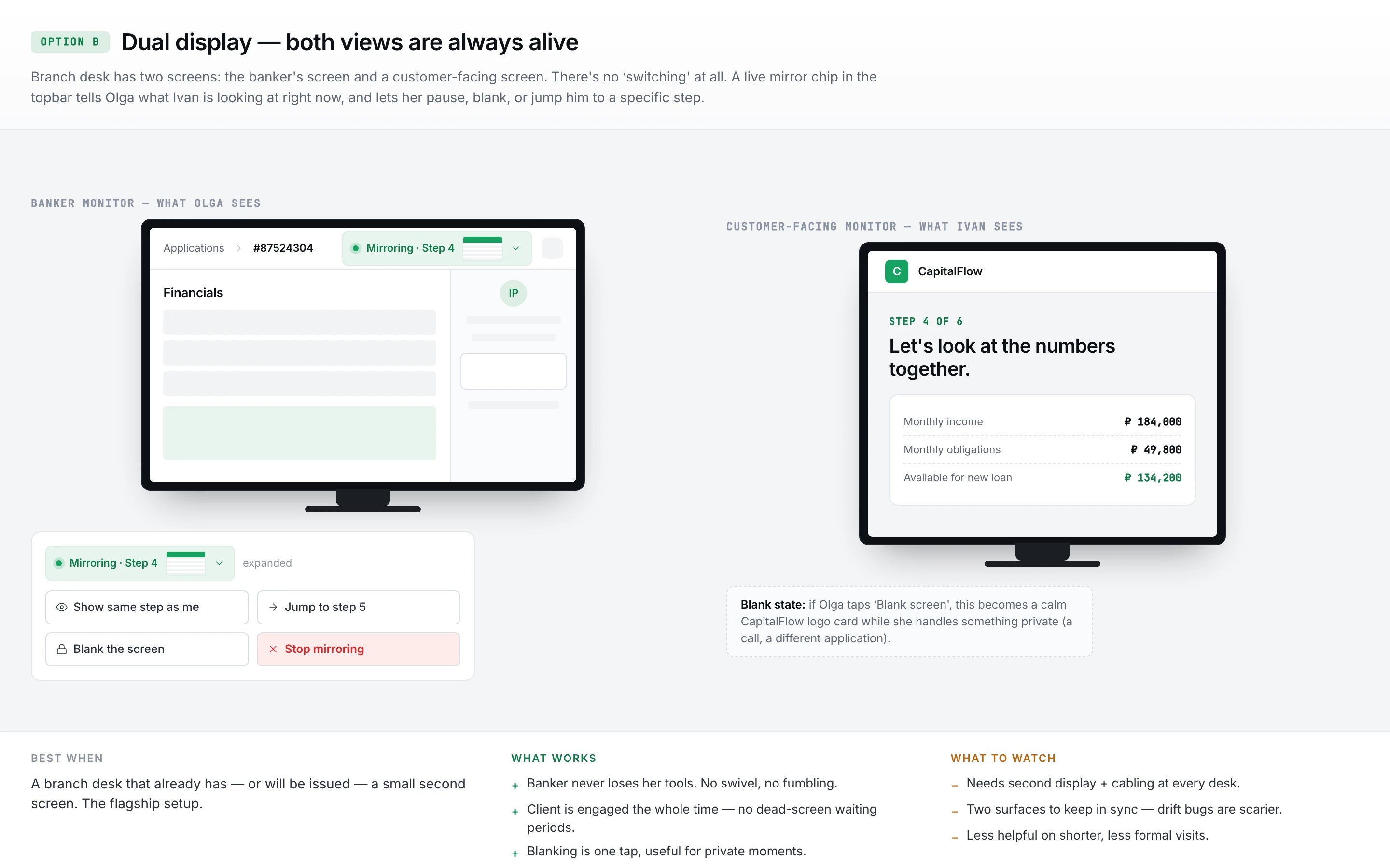
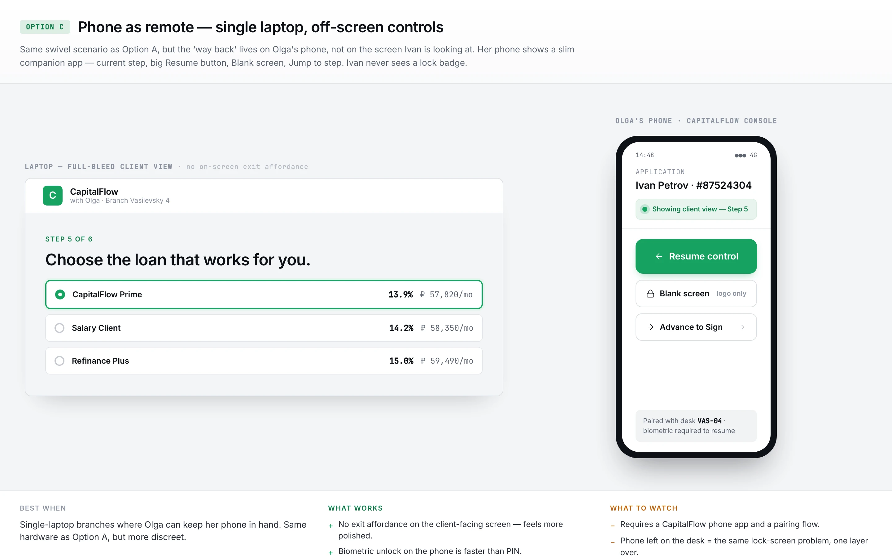
The third option keeps the swivel but moves the banker's controls onto their phone — resume control, blank the screen, advance to Sign — so nothing has to be reached for across the desk once the client is reading. It costs a paired device; it buys a client-facing screen with no banker chrome on it at all.
Everything in the flow leads to this screen. The client has been answering questions for fifteen minutes. The banker hits submit. Three to five offers come back. Banker turns the monitor.
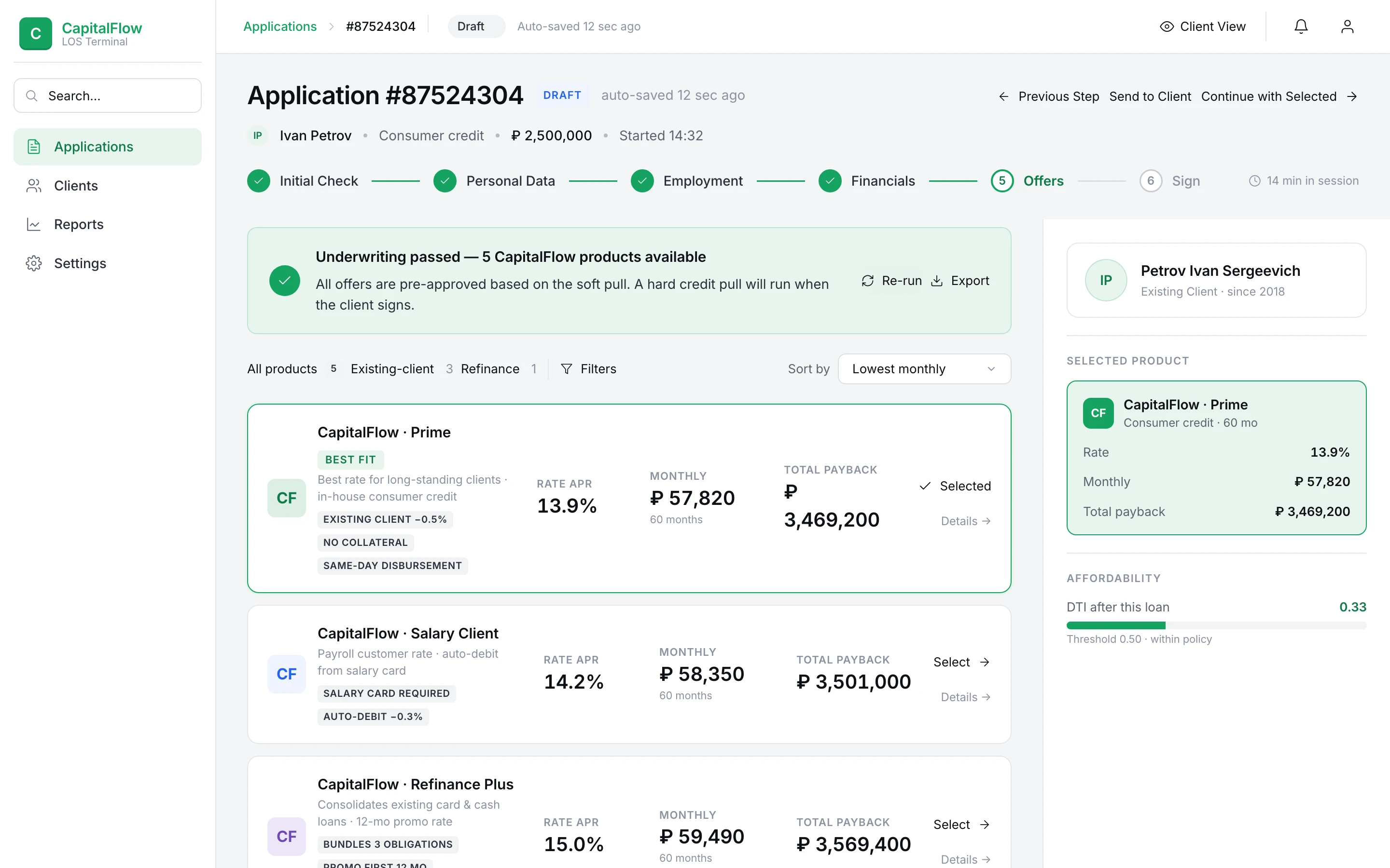
In banker view, this screen is a comparison table — terms, rates, monthly payments, fees, dense rows the banker can scan and recommend from in seconds.
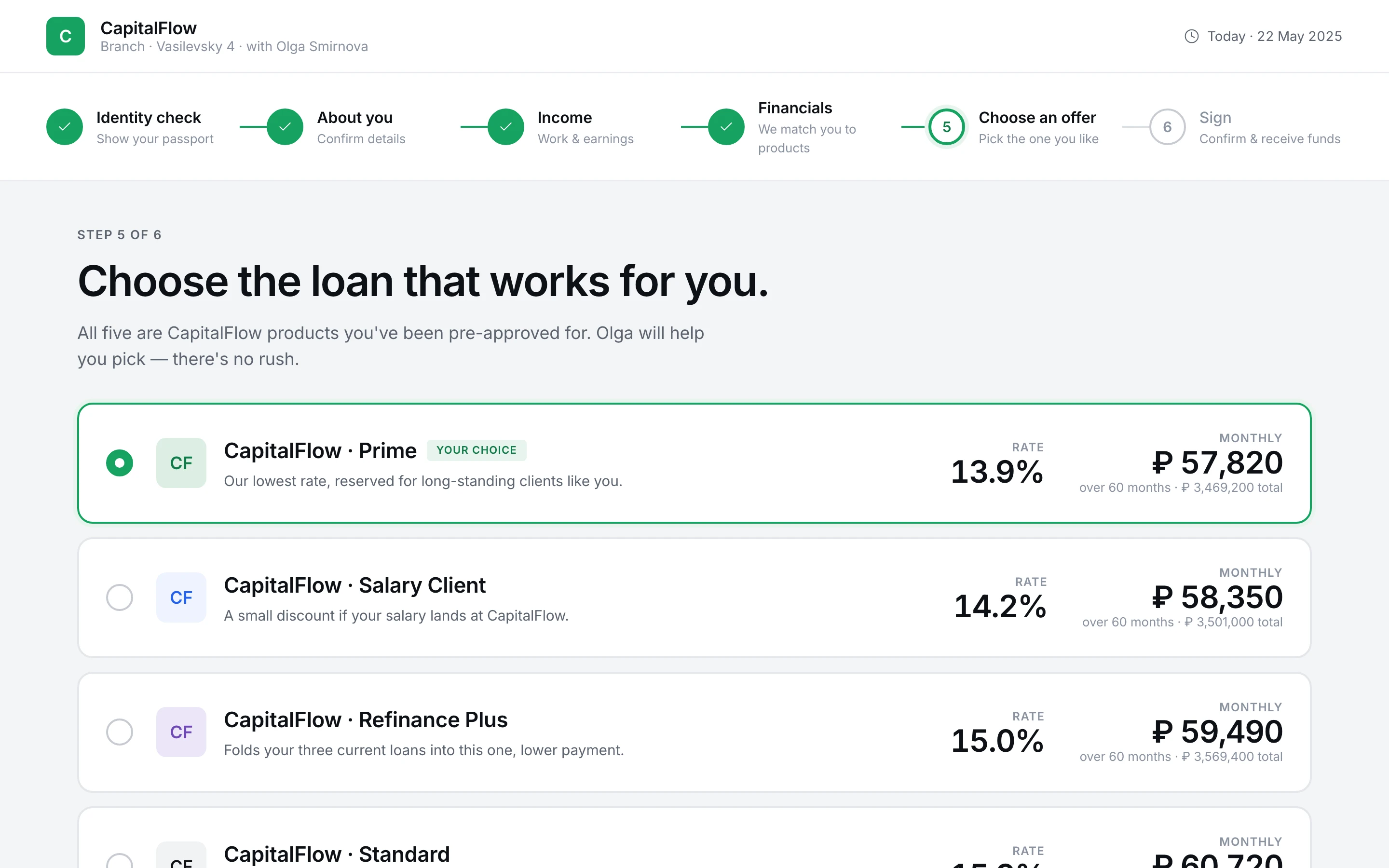
In Client View, I rebuilt it from the floor up. The table goes away. Each offer becomes a card. The monthly payment is the biggest number on the screen, because that's the number the client will actually feel. Rate and term sit beneath it at a readable size. Fees and conditions live one click away, for when the conversation gets to them — not the moment the screen lands.
The banker doesn't lose anything; they're still in the room and they remember the comparison table. The client gets a screen they can read without leaning forward.
The brief said modern. The trap inside that word is the generic startup-dashboard look — purple gradients, glassmorphism cards, oversized rounded corners, a mascot grinning somewhere on the page. That reads as a two-year-old SaaS startup. It does not read as a bank handling someone's mortgage.
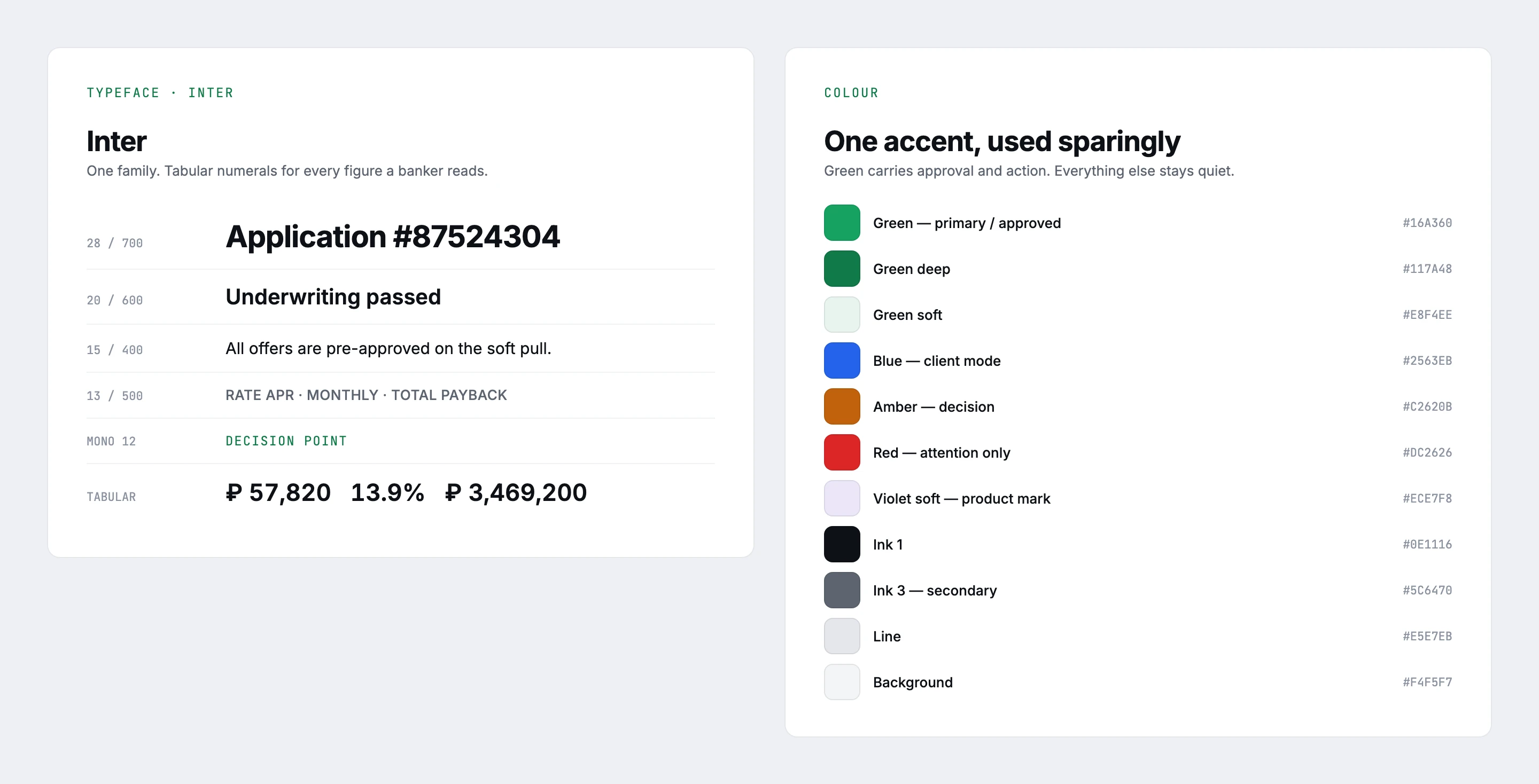
What I steered toward instead: the Stripe / Mercury / Linear lane. Light theme. Strong typographic hierarchy. Data-dense but breathable. One accent color, used sparingly. Restrained iconography.
Client View inherits the same language at a larger type scale rather than becoming its own brand.
The design went into testing during that research round and scored 4.0 out of 5 for usability, up from 2.5 — errors per session dropped from roughly 15 to 5, a two-thirds cut, most of it on the client-facing screens the original never accounted for. The frames on this page are a later iteration of that same design; the numbers belong to the build that was tested.
What I value most, though, didn't come from the numbers. The turning-the-monitor habit was invisible until I sat in on real appointments. "One product, two very different users" only became the brief because the research made the second user impossible to ignore.
The product had been in production for years, and the bankers using it had the field order, the tab logic, and the keyboard shortcuts memorized. I treated that muscle memory as a constraint, not a blank slate — the banker side keeps the structure they already know, so nothing they do a hundred times a day moved on them.
Client View screens were drawn 1:1 with their banker-view counterparts, so the toggle never produces a surprise — same content, same order, just rendered for a different reader.
I deliberately didn't touch the offer-generation logic or the credit-decisioning rules; those belong to the bank's risk team. My scope was the interface the banker and client meet at the desk.
- 12 months from kickoff to production rollout.
- 170+ branch offices running the system — every office of the bank.
- 6 steps from intake to signature; 10 screens — 6 for the banker, 4 for the client, mirrored at the moments the client is looking.
- 18–20px minimum type size in Client View.
- 3–5 offers on the decision screen.