

How I designed a field app that puts everything a collector needs in one place
Meridian Bank — the mobile app field collectors carry to the debtor's door: a priority queue, a routed day, the whole case file, and evidence captured on the spot
Meridian is a stand-in name; client and employer names are anonymized and every value on the screens is fictional. This is a self-initiated redesign of a product I worked on — the requirements and the users are real, the interface shown here is my redesign direction, not a shipped release.
Financial Information Systems builds the collection platforms banks run to manage overdue loans. One bank needed to push that system out of the office and into the field — a mobile app for the agents who physically visit debtors at the hard-collection and enforcement stages.
The catch is what those agents have to carry. Everything they need lives in a dense back-office system: multiple loan contracts, court cases, collateral, payment histories, and compliance rules like do-not-call windows. All of it has to work one-handed, standing at someone's door, often with no signal.
The original app did the job. But years of stacked requirements had turned it into a wall of dividers, tiny labels, and collapsing accordions — something you read rather than something you glance at. That's the problem I took on.
Redesign the app to feel modern and calm — without losing anything. I held myself to five rules:
- Half a second. The number that matters — urgency, amount, next stop — has to land at a glance.
- Space over lines. Trade cramped rows and hairline dividers for grouping and hierarchy.
- One language for urgency. Overdue severity gets a single, consistent meaning across the whole app.
- Thumb-first. Primary actions in reach, bigger targets, sticky headers.
- Lose nothing. Every field, every tab, every flow survives — plus the states the original skipped: offline, empty, loading.
The visual language had to work in a tense moment outdoors — at a door, one-handed, maybe in the rain. Inter with a tight type scale and tabular numbers; a deeper, more serious teal on a soft neutral base; soft cards and bottom sheets instead of divider-heavy lists; segmented tabs and pill filters.
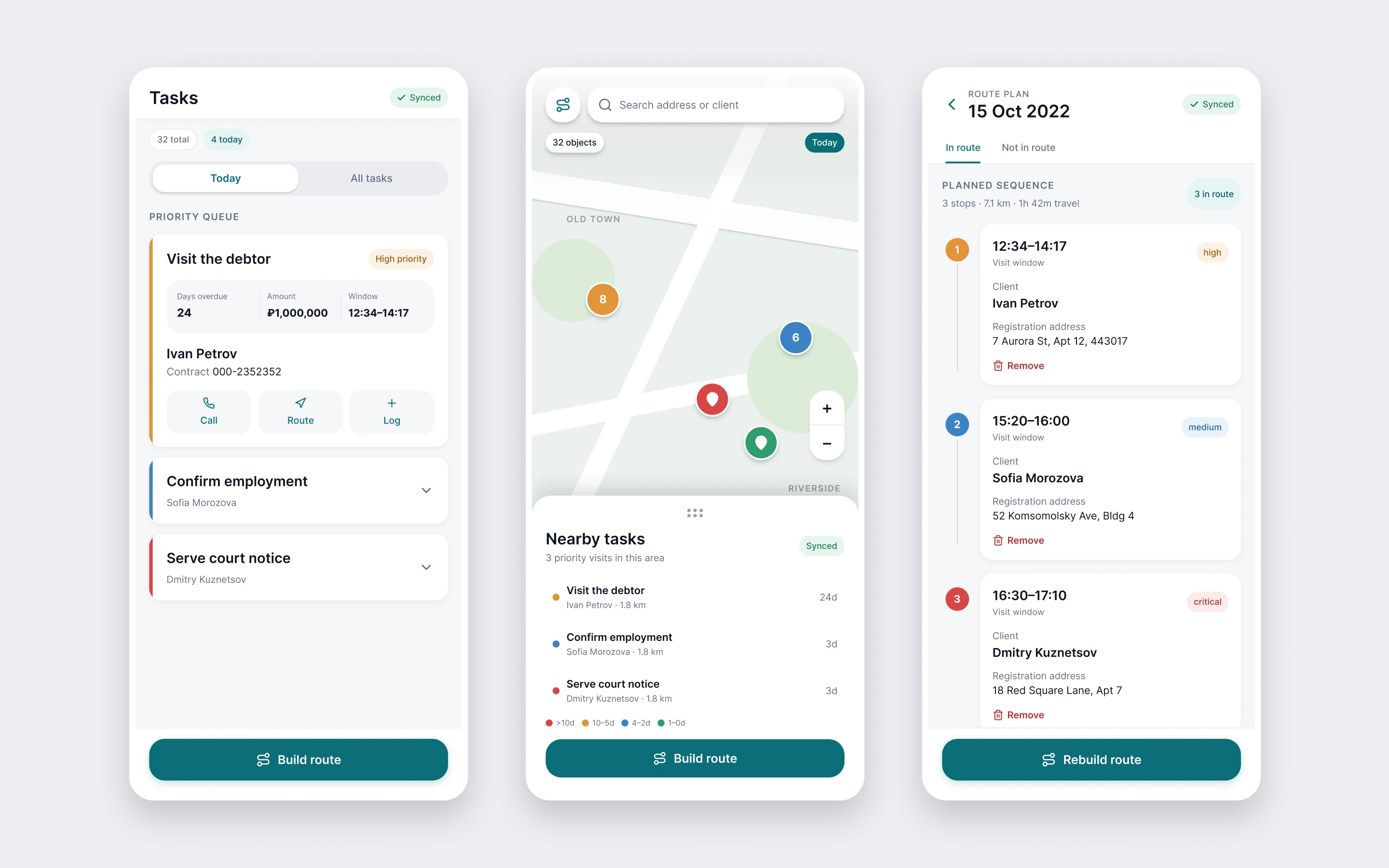
The decision carrying the most weight is the urgency scale. Days overdue map to four steps — critical, high, medium, on track — and those four colors mean exactly the same thing on the task list, on the map pins, and along the route. The agent learns them once, then reads the whole app by color.
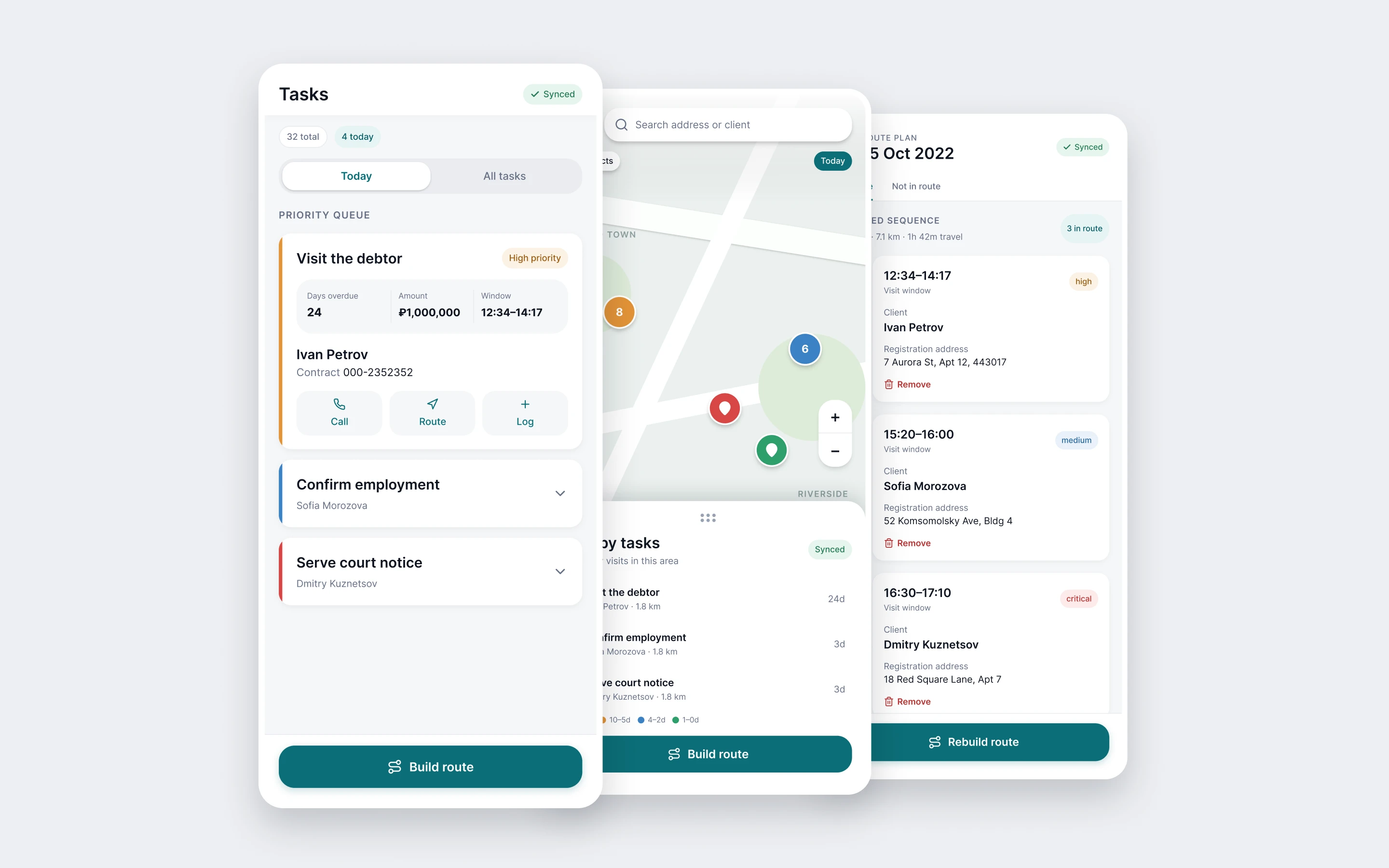
The app opens on a priority queue, not a database. Each task leads with a three-up stat row — days overdue, amount, visit window — and an urgency edge down its side, while the contract number and the rest recede into quiet secondary text.
From there the agent plans the day. The map shows every debtor as a pin in those same urgency colors, with a bottom sheet listing what is nearby and how far. The route comes back as a numbered timeline — three stops, 71 km, 1h 42m of travel — instead of a stack of identical cards. Plan the day in three taps.
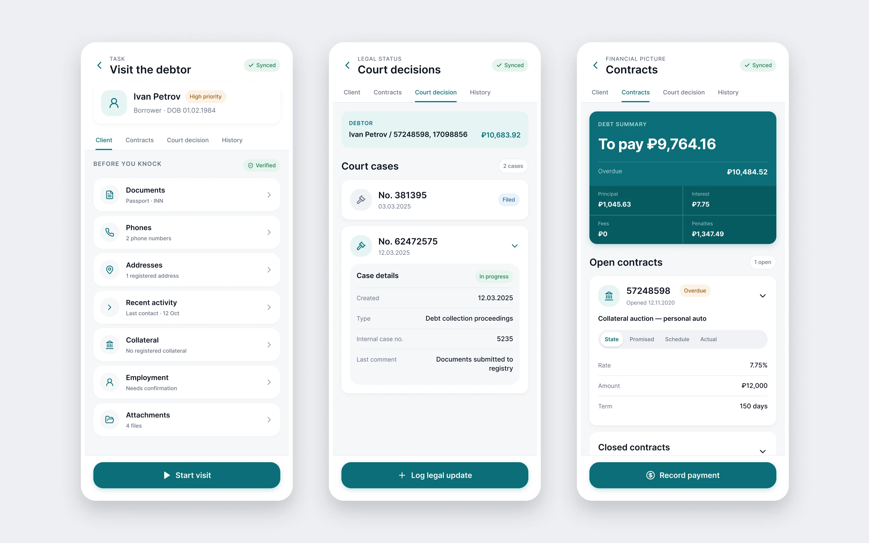
Tap a debtor and the full back-office file opens, reorganized for a phone. The client screen is a before you knock briefing: identity at the top, then documents, phones, addresses, collateral, employment, and attachments as tappable rows, each saying what is inside before you open it.
Court decisions become a readable case list with status pills rather than a form dump. And contracts lead with one debt-summary card — to pay ₽9,764.16, split into principal, interest, fees, and penalties — with the full ledger tucked into segmented sub-views beneath. It's the same financial detail the desktop system holds, but the number that matters comes first.
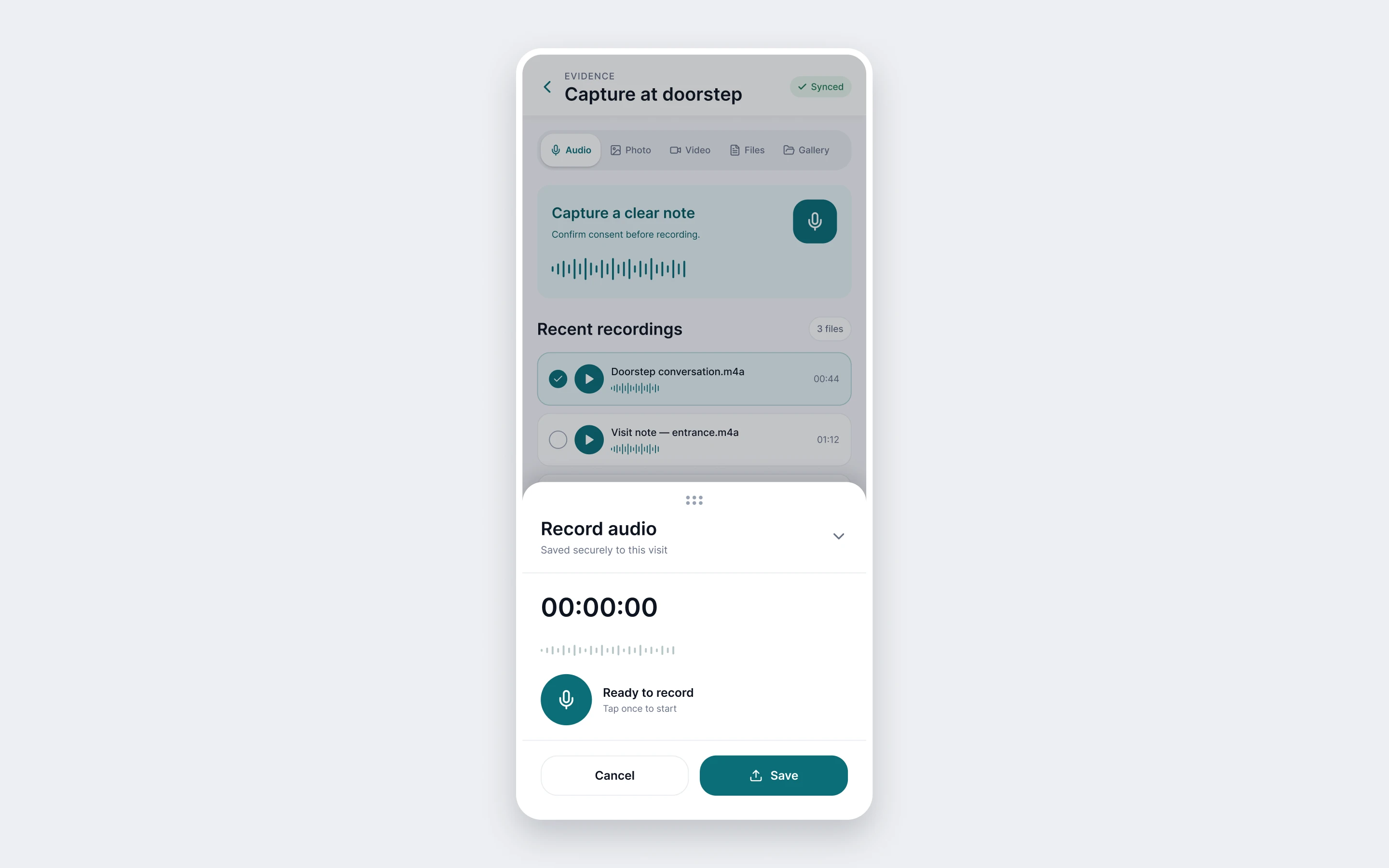
The legal record gets built at the doorstep, so capture had to be faster than the conversation. One calm hub: a large record button with a live waveform, a consent reminder before recording starts, recent recordings ready to play back, and one-tap switching to photo, video, or files.
Same data, same flows, a completely different feel. The wall of dividers became a system of soft cards and space. Scattered red and grey states became one urgency language. Stacked route cards became a timeline. A contract dump became a summary-first card with the detail one tap away.
The old screen made you read it. The new one you can glance at — and a glance is all the time you get at someone's door.
I worked from the original requirements rather than a blank page: every field, tab, and rule on these screens traces back to the real spec — including the unglamorous ones, like do-not-call windows, third-party contacts, and offline sync of reference data. A redesign that quietly drops the awkward requirements isn't a redesign; it's a mockup.
I also kept the structure the agents already knew. The four tabs on the case file, the order of the sections, the actions on a task — all still where they were. What changed is how they read, not where they live.
Scope was deliberate: the mobile app, for retail debtors. The supervisor's desktop monitoring workstation belongs to the same system, and I left it out rather than half-do it.
- 7 screens redesigned end to end — queue, map, route, case file, court, contracts, capture.
- 4 urgency levels — one color language, used identically across list, map, and route.
- 3 taps from opening the app to a routed day.
- 120 pages of requirements the redesign had to keep intact.
- 1 hand — the whole app is built to be used with one.